Monday, 30 November 2015

Poster Draft 1 (Meg)


I chose to have a black background within a landscape canvas to hold the imagery in. The contrast of a white bowl with blood red soup. As I used a stock image for the letters meaning it's difficult to make the text bigger, however I have considered in my official poster that it is the main focal point.

Lovefield - Short Poster Analysis 4

Lovefield is a interesting short film, with a huge reveal at the end. The poster has a very dark feel to it. The clouds are grey, almost black, however, there is also an opening to blue sky breaking the clouds up. This could connote good within the bad, or a path to good. 

The actors names are seen right at the very top of the poster in white text which contrasts with the background. All of the text is white, but they use different fonts. The biggest font on the poster is the title - which is the focal point. The billing block, which is underneath that, in a much smaller and narrower font, but still within the same colour scheme.

The character seen is above the poster, almost looking down at the title. This could suggest his superiority in the film, however he also looks like a farmer, as the mise en scene shows the cornfield setting, and his denim dungarees and cap costume.


Silent Things short film poster analysis 3

This poster is from a short film starring Andrew Scott, most commonly known for his role Jim Moriarty, in the series Sherlock Holmes. The unique selling point is that Andrew Scott is part of a very widely known, crime drama television series, which leaves the audience to recognise the man on the poster. They also use Georgia Groome who is known for her role in 'Angus, Thongs and Perfect Snogging'.

Interestingly, they use both antagonists and protagonist in this short film poster (contextually you wouldn't know this, but they almost make it seem that the relationship between the man and the woman is romantic, even though it isn't). This is quite unusual as you'd stereotypically see just the protagonist.
The setting is of a beach which suggests romance within the two characters, although the image across the top of the poster is of our female character, with more of a distressed facial expression. To the audience, this already starts to make us think that she is at a loss for whatever reason, and this man has made her happier.
The photos are conventionally a medium close up/close up and can also be a two shot.

This poster is very centred, and uses the same colour font throughout to keep in touch with the colour scheme. The colours almost make a sepia effect, which doesn't connote danger, which suggests this film is either a romance or a drama. "Silent Things" is the largest text on the poster, which is the main typography focal point. The billing block is in a very small font so it doesn't navigate away from the main point of the poster. The characters names are featured, but the text is also quite small. This suggests they are all as important roles as the other (they also seem to go up in a ranking - protagonist >>> antagonist).

Right at the bottom of the poster are nominations for different film festivals. By doing this, it's showing the audience what others thought of the film. A film nomination is a good thing, and as the characters are well known from other popular tv programmes and films, it will encourage the audience to go and see the film.

MIXTAPE Short Film Poster Analysis 2

This is a Short Film poster of the film 'Mixtape'. This particular poster is quite interesting as it doesn't involve any characters within the image, (either being the protagonist(s) or antagonist(s)). It actually involved the object belonging to the film title - a mixtape.


The background is a very bright colour, suggesting it's an uplifting happy film, it also is of the colours of the centre point of the poster (the mixtape).


The colour scheme is also the same all the way through, white font against the yellow background, and red text towards the bottom of the poster. The fonts for the poster all relate to the label stuck on the mixtape. This makes the poster work well together, it also shows they have thought well about the design.


The actors in the film all have their last names in capitals rather than both first and last names. This could potentially be for remembering purposes, or could be for style.


At the top of the film poster, and towards the bottom are "official selections" and nominations. This gives the audience an insider to what other people like, being nominated "best short film" and "grand prize winners" is a good thing, hopefully leading audiences to go and see the film. 

Film Poster Draft - Alex

Following my film poster research, I have created a poster for our own short film. This is what I have created for the first draft hand-in:

I decided to stick with a darker theme because of the themes/code of our film. Originally, I was going to base the film poster in a bowl, but couldn't find any decent images. I decided to edit a picture of a spoon by covering it in blood. The background is of alphabet spaghetti to fit the conventions of our film, and it ties in nicely with the titling within our film. 
  • I don't particularly like the font used for 'Soup' because it seems inappropriate for the film and almost childish, this is something I will look to edit in my next draft.
  • I'm also not sure about the black background - I used a very opaque image of the kitchen we filmed in, and feel it's unnecessary. I will review this in my second draft. 
  • I really like the simplicity of this short poster, and it doesn't feel overcrowded. This is important for short films; you get a sense of the film plot, but nothing is given away.
  • I also like the professionalism achieved by using the original credit block font and keeping the conventions of mass-produced posters.
 For my next draft, I will look to change the title's font and the background.


Sunday, 29 November 2015

The Woman In Black (Film Poster 1) - Meg

This poster is from an international film starring Daniel Radcliffe, most known for his role as Harry Potter. The unique selling point is that he is from an extremely popular franchise, causing the audience to recognise him straight away, making the films popularity go through the roof.

This film has a variety of different film posters, this allows the audience to see the film from different perspectives if you like.

I've chosen the one on the right purely because you can see our main characters face in an extreme close up. The point of a close up shot is so the audience is able to see into the character, as you can see very little emotion in his face, this could suggest something is very unnerving about the movie/
The blue in his eyes also links with the colours within the poster. because its quite pale, it could link with fear also.

The other character is in the background, which as an audience we already associate as being the antagonist. She's in front of a cross which could signify death, as in a graveyard of some sort. Our female character is also directly above the title, also giving away that she is "the woman in black".
The clouds also look like they have just formed, causing them to come together, leaving gaps in between them. This could suggest pathetic fallacy is also being involved with the poster/ Raising the tension with weather is an excellent method to show sadness for e.g. rain & gloominess.

I think the target audience for this film by looking at the poster is a range between early teens and upwards. The rating for this movie is actually a 12A, but because our character looks like a young adult, it seems like it would maybe appeal, to a slightly older age group than 12.

The text is actually blurred into the blue wash of the poster, and blended with the misty look.
Mist has strong connotations of ghosts, and other scary things. Within a horror poster you obviously have to also follow the conventions of a horror film, leaving room for the audience to raise the enigma.  They also have a few links at the bottom, and the age rating. A very small font is used to make sure it's not stealing all the attention away from it's main focus.

Wednesday, 25 November 2015

Film Poster Research: 'Fumer Tue' [Alex]

'FUMER TUE'

This short film poster is from a French film festival. I thought it would be interesting to look at international interpretations for inspiration.

Just like 'Superhero', the general formatting of the poster is very simple and isn't overcrowded with information or images.

This short film doesn't include any actor names on, and the largest font used is the title. The title, alongside the main image gives indication into the plot line.

The main image is a carton of generic cigarettes with sticking out, poking towards the viewing audience. It's almost as if the person in the image is offering the audience a cigarette. This particular format interests me as they have included the directors' names on the carton as an overlay - normally where the name of the cigarettes are.

As for the title of the film, 'Fumer Tue' translates to 'Smoking Kills' - which juxtaposes the suggested image. The font is a bold, white font that contrasts the dark background - this is expected in film posters as they can be seen from a distance and capture the imagination. I also like the simplistic style of this; as well as being centered, the title features a white box around it to maintain formality. As there is only one image on a fairly dark background, the text may look out of place without it.

The billing block is also different to many other film posters as it does not keep the generic font - it looks as though this film has used an edited version of 'Ariel', a generic font available on all computers. Again, the credit block is centered to keep the structure of the poster, and works nicely as the opacity has been slightly lowered.

This poster also includes the production company logos in the far right corner. Although they are very small, it's an interesting feature to include. This is something that many feature-length films avoid, and is an odd detail for a short film. This could be helpful if the film has a smaller production team/billing block, just to fill out the bottom of the screen more. As we fall into this criteria, having only 3 of us create the film, we could consider adapting our posters like this.

It's hard to suggest an audience right now for this film, mainly because no clear genre is shown; so that does tarnish my feelings for it. Keeping in mind that many short films do not adhere to just one genre, or any genre at all. 

Edit: I have had some issues uploading this particular blog post, but as of 4th December, it seems as though this has been fixed. Very sorry for the inconvenience!

'World War Z '-Feature Length film poster (Holly)


 'World War Z'

  The poster is minimalistic, the black and white colouring, makes the 'Z' stand out, drawing attention to the title.
The genre of the movie becomes apparent, looking at the image, the audience would assume it is a post-apocalyptic film, potentially a zombie film, given the wreckage shown and the mass of figures on the helicopter, the silhouette of the figures leaves them unidentifiable, creating intrigue within the audience. However limbs can be seen and the figures are clearly human, which assumes the genre more, along with the title, 'World War Z' which the Z, would usually refer to 'zombies', which shows the audience the genre as a zombie film.
The 'Brad Pitt' is placed high up on the poster, above the image, which draws attention to his name. As he is a high profile actor and has his own fan base, his fans create an audience for the film, as well as fans of the genre of the film. Other than the name, there is no other information around the film, other than the release date which is unlike other feature length films, as it usually features directors names or reviews.
I like the minimalist and the black and white causing the red to contrast and stand out, which draws the attention to the title, this is something I would like to use on our poster as it pulls focus to the audience, and creates enigma.

'What if'- Feature Length film poster (Holly)

What if
What If - Poster
The film genre is apparent right away, the location setting and the poses both characters are in make it clear to the audience it will be a romance influenced film, potentially a rom-com. The setting of a diner is a cliché location for romance movies as it hold the symbolisation of new friends or meetings. The composition of the shot with the male making the female laugh is a typical affectionate pose used in romance movies, once again showing the genre and attracting an audience.
The male character is played by Daniel Radcliffe who is a high profile actor, which as he has his own fan base, has already put together an audience for this movie, the poster already has the features of a rom-com, so an audience who prefer that type of film, usually teenagers or young adult females commonly watch romantic comedy genre.
The bright vibrant colours along with the white background contrast and make it stand out, bringing attention to the poster.
The narrative becomes clear as the audience see the tagline, and the genre now becomes clear that it'll be a romantic comedy.
The names of the actors are listed in white down the side of the picture, making them stand out, the high profile actors are nearer the top, their fan base could generate more of an audience for the film.
Overall I like the minimal vibrancy of the poster, it has a clear message to the audience as to the genre and the storyline, which is easy to attract an audience.

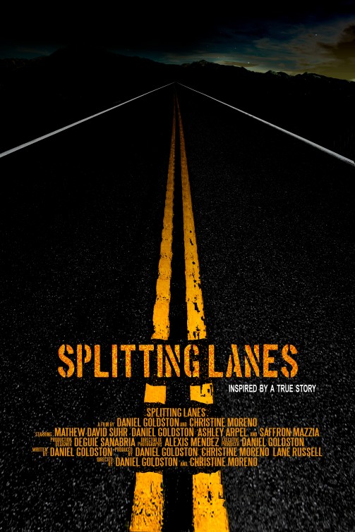
'Splitting Lanes'- Short film poster (Holly)

 Splitting Lanes
Splitting Lanes Short Film PosterThe poster uses dark colours to show the scene is set at night. We would assume the genre of this film is horror or thriller. The split is clearly shown between the two sides of the lines with the background sky. The left side is shown with dark macabre colours, giving the sense of the unknown, and the right side shows clearing sky, with stars and the outline can clearly be shown of hills or mountains. The split between the lines could show a good vs evil opposition and a distinct split between either side. The genre of the film as a horror or a thriller is outlines by the bold white words 'inspired by a true story' which is usually used to generate fear in an audience for thriller movies. The font is bold and in the style of road markings, giving a direct link. The outline of the road is given the effect of 'never ending' giving a sinister mood to the poster as it leads into the darkness. I like the direct link between the font and the road markings, the yellow creating a stand out effect. From the style of the poster you can assume the narrative will take place at night on a dark road, and could potentially have a split or oppositions between conflicting sides.
There are a lot of names mentioned in the smaller credits, such as the director and the actors. This is a common aspect of feature length films, as actors usually generate an audience. We can assume from this the director or actors have some sort of influence in the industry to attract an audience.
This is something we probably wont use in our film poster as we only had three actors in our film. 

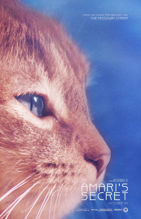
'Amari's Secret'- Short Film Poster (Holly)

Amari's Secret Short Film Poster
 Amari's Secret 

The short film poster 'Amari's Secret' uses minimalistic design to portray the film, which is something I would like to use for our poster, drawing attention to minimal details.
The narrative from this poster leaves a question to the audience as to who is 'Amari' and what is their secret? The CU side profile of a cat is used to advertise in which the focus is pulled towards the cat's eye, which could suggest the cat is Amari, or in which the cat is witnessing something. The phrase 'curiosity killed the cat' comes to mind when I see this poster, and could suggest the secret is potentially dangerous.

The poster uses bright colours which draws attention to the main features, being the cat's eye, once again suggesting the cat is witnessing something. The genre of the film is unclear, but through the title you could suggest it is a thriller, the bright vibrant colours could be used to disorientate the audience.

The font is small and spacious, the white standing out against the background , the size of the font could give a direct link to a 'secret', being conspicuous.

Actors names are not featured on the poster, the length of the film could be reflective of this, as feature length movies usually have named actors to generate more of an audience. However this film has a 'From the studio that bought you:' which relates a direct link to the audience who watched the film before, giving the film a demographic and an audience.

I like the focus pull and the minimalism of the poster, which is something I want to use for our final product as it gives an effect to the audience to pull the attention to a specific part, an enigma is produced within the title, as the audience questions what the secret is, which the short title of our film 'Soup' would hopefully create intrigue to the audience.

Film Poster Research: 'Superhero' [Alex]

'SUPERHERO'

This short film poster is the most idealistic, and the poster that I will use as an inspiration for my own poster.
Unlike the feature-lengths, such as 'Shutter Island' that uses two images, this film only uses one. The total running time of the film is 6-minutes, so using anything more might suggest more of the narrative, thus, ruining the plot.

As this is only a short, no actor names are shown. In feature films, the stars usually sell the films, whereas this wouldn't be necessary for a film that can be viewed any time online. 

The font used is also unlike other posters as they use a simple font, and making the word 'hero' bold. A simple font can work nicely when the background is plain.

Personally, I'm a fan of these short films that feature a small logo. They feel like a small insight, or a hint towards the narrative and can be quite enigmatic depending on the genre. The slogan of this short; "You don't need superpowers to be a hero" is heartwarming, and having not seen the film, I could see that the target audience would be aimed at an older, mature audience.

The credit block uses a different font, which is not commonly used in film posters, but also gives this poster a unique twist. With posters, you don't want to use too many unconventional fonts, and the simplicity of this means that using a third font on the credit block could make the overall look quite overwhelming.

I like that this film advertises their website in a larger font than the creators names, as they really feel the film itself is more important. I liked this approach and feel I'm going to apply it to my own poster.

As for the colour scheme, the editor has kept to essentially 2 main colours - the blue tint of the ground the characters are walking on, and a splash of red in the older character's cape and in the title. Simplicity is really grabbing me in this poster, and it makes me want to watch the film simply because I have no idea about the narrative development (which I believe is ideal in a short film poster).

'SOUP' Bloopers Reel

We had a lot of unnecessary footage, and thought a bloopers reel would be a great idea! Obviously this won't help towards our grades, but it's a great lookback on the fun we had filming this. Enjoy!

THE FINISHED PRODUCT!

We're very happy to say we have completed the editing process of our short film 'SOUP'. We hope you enjoy it as it's clearly our best to date! Thank you for following our blog updates so far, there's plenty more to come.

"From the directors of 'ELIJAH' and 'I'm Batman', 'SOUP' follows a young girl out on Halloween night after a successful night of Trick-or-treating'ing and desperate for her fill of sugary goodness. Instead, she's met with her somewhat psycotic babysitter and a meal she will never forget"

We will also share this short film via. Social media and obtain audience feedback - ensuring that we obtain critical and analytical feedback from our target audience, and those outside of the audience.

Film Poster Research: 'Shutter Island' [Alex]

SHUTTER ISLAND 

This feature-length film poster is the most typical of the film posters I am analysing. 
Two images are shown on this poster for advertising purposes. The first shows the main actor, a star within the Hollywood scene. Leonardo  DiCaprio's face and name are plastered over the film poster as he is the main fascinator as he has his own fan-base. A narrative is suggested as DiCaprio poses, looking uncertainly into the distance, and highlighted by a lit match that casts a dark shadow on his right-side. The darker colour scheme of this poster suggest that the themes and narratives within the film are fairly sinister.
The title of the film is centred, and uses a bold white font to contrast the dark background. This slightly opaque font fades nicely into the background, the make the text one with the image, rather than plastering it on top. The text is also positioned slightly behind the image of the the island, which from a design point of views, brings the poster together.
The image of the island itself is fairly blacked out, showing more of a silhouette of an island. This image creation foreshadows the isolation and danger on the island. The audience can also make an assumption that the main actor and the island have some link.

Unlike other posters, no audience is suggested - which makes it very universal. If any audience were to be suggested, it would be those who watch neo-noir psychological thriller films.

My main interest in this poster would be the tag line/slogan that is boldly presented in a faded red font, specifically positioned the catch the eye of the audience. The line says: 'Some places never let you go' - this personifies the island and creates and creates a demoralising personality; which in-turn, also suggest a narrative. The release date is also shown in the same bold, red font to catch the audience's eye - the image has already captured their attention, and now they want to see the film; so the release date also has to be visible from a distance.

The credit block is also very typical of a Hollywood blockbuster. It depicts the main creative roles of the film, and plasters the directors' name as frequently as they can. Again, this will not be essential for our film poster as we only had three creative directors.

Film Poster Research: 'Black Swan' [Alex]

BLACK SWAN

This special festival adaptation of 'Black Swan' was presented at the 'Hacked Off Films' festival, therefore, the poster shown above will not be the original.

The poster is has a simplistic design and sleek structure to foreshadow the themes of ballet within the film. The choice of black and white gives the impression that there is a dark theme within the movie plot line, so gives an impressionable look. This poster does not feature any actor names, release dates or reviews (which we might expect of a highly acclaimed film such as this). As this film was presented as a prestigious event, any additional information focuses on the event itself (e.g. Location, time of event, dress code).

If we were to compare this poster to the original feature-length version, we will see that there are very notable differences.
In terms of colour schemes, the film poster maintains the monochromatic feel, but has splashes of desaturated colours in the crown/make-up. 

This poster has more of a narrative, compared to the festival version as we can see who the main actor is. The poster shows a head-shot of actress Natalie Portman looking into the camera, cropping just below her shoulders. The character shows their vulnerability as they hide behind a very full-on face of make-up, compared to her exposed body. The film itself explores very feminine subjects, and the struggles that women of ballet face to maintain their thin, yet physically fit bodies. This is a clear representation of the dancer world, and could suggest an audience (e.g. Female dancers). The genre of this film is labelled as a  psychological thriller-horror, which would also suggest that this is a film aimed at an older audiences.
Just below the actors face, we are presented with the main actors names; these people are stars, and will help promote the film. Natalie Portman, Vincent Cassle and Mila Kunis's names are the second largest type to prove their importance. As the image will be the main fascinator,  iIt is important to have the title as the largest type to make people want to watch the movie.

This film poster also has a credit block, which we expect of feature-lengths. 
In this, the poster states who: presents, who they are in association with, which production team, the director's name, music supervisor, film editor, production designer, direction of photography, the producers, original story author and finally the screenplay actors.
These roles are not credentials for our own short film as we only had three people on our production team - however, it is important to see when the credit block is used and why it is necessary.

The film also has two of its film festival reefs  just to the side of the actor's neck - they are visible, yet small. They act a token of importance and demand - giving more reasons as to why the viewing audience should want to see this film.

Thursday, 19 November 2015

FILMING DAY 2

Here are the videos we took when Alex and I were filming on Wednesday.
We struggled most with the placement of the eyeball in the soup, as it got really difficult to have the eyeball facing upwards, so we took plenty of test shots and kept the camera running.
As the eyeball was made out of clay, the paint began to come off, so we had to work quickly.
Here is a video of all the test shots we used with the eyeball. 

As we filmed outside we also struggled with lighting the characters outside, which we will probably have to alter in Final Cut Pro.

1 day until the Editing Deadline!

After a successful day 2 of filming, we have finally completed all of our filming! We will now spend the majority of the next two days perfecting our short 'SOUP'.

Here's Alex in the editing suite, bright and early.

So far, we have edited 2 minutes worth of our film during our college frees and are very happy with the results. This is what the current timeline looks like as of 9:08am:

We will check in soon with behind-the-scenes footage from our day 2 of filming, and how far along with our editing we are.

Wednesday, 18 November 2015

EYEBALL MAKING

As we are filming the rest of our film today, we were gathering and making last minute props for the scenes we need.
For the last shot of our film we want to have an eyeball popping up out of the soup, to create shock to the audience, Alex and I ran out of options of the props we could use for the eyeball so we decided to make one.
We began by watching tutorials on YouTube on how to create the eyeball.
We rolled up clay into a ball shape and began painting.

This is our final prop, which we will place in the soup.

Monday, 16 November 2015

SOUND CONSTRUCTION


Much like our last film, we are using Royalty-Free music obtained from Incompetech.com - a free service that allows users to download professional sounding music for their own use and projects.

We had to look at the conventions of our film and see what genre conventions we wanted to achieve. Personally, I felt that a piano track would be quite eerie; so looked for a slower, more down-tempo sound. Here is what I had found:
'Awaiting Return'
"Awaiting Return" Kevin MacLeod (incompetech.com)
Licensed under Creative Commons: By Attribution 3.0
http://creativecommons.org/licenses/by/3.0/

'Dreams Become Real'
"Dreams Become Real" Kevin MacLeod (incompetech.com)
Licensed under Creative Commons: By Attribution 3.0
http://creativecommons.org/licenses/by/3.0/

'Moonstone'
"Moonstone" Kevin MacLeod (incompetech.com)
Licensed under Creative Commons: By Attribution 3.0
http://creativecommons.org/licenses/by/3.0/

SHORT FILM TITLING

We viewed various short films and analysed their titles to help us with our short film, as they are very different to the usual openings of feature length films. The titling also takes into consideration the genre of the film, and how it would be received by audiences. The titles have a direct correlation to the film through the narrative.

For example in the short film 'LoveField', the titling begins with the production company logo, then instantly opens into the title of the film, this could be because of the length of the film, things such as directors or actors names could not be as important, so to fit all the narrative in the allotted time slot.
Short films generally use the format of less titling to introduce whereas in feature length films, introductions are usually used (or openings) before titles. Most short films use minimalistic openings or titling's, which is something we will take note on in our film.