1. In what ways do your media products use, develop or challenge forms and
conventions of real media products?
Camerawork is very
important for all film types whether it be a short film or a feature length
film. As one of our tasks we were researching the conventions
of a short film. Throughout my research, I noticed that a lot of medium close up shots (MCU), as well as extreme close ups (ECU), which
admittedly are used less; although, they also seem to use medium long shots (MLS) frequently too (as shown
in the short film “Identity”). However, they do use extreme
close ups more in “The Elevator”.

(SCREEN
GRAB FROM 'THE ELEVATOR')
I feel that these two films are so
different (as one is almost a surreal documentary
type, and the other is comedic) that they
use different techniques to show their genre. The angles are generally eye-level as a way of “being in the shoes of the protagonist/antagonist”, it’s also common to see
is a medium shot/angle which is used to capture a conversation, or to watch
the short as an outsider rather than watching it through the characters perspective (point of
view angle). By doing this it could represent
the equality within a situation, or a social status, although ‘Black Hole’ uses low angle shots, which suggest that he is powerful, making him to be the
superiority. This particular film also uses eye line matches throughout, which already brings a different dimension
into film making, specifically in the shorts I researched.

(SCREEN
GRAB FROM 'THE BLACK HOLE')
The sound used in this film is mixed between diegetic and non-diegetic sound. This particular blend is commonly found in short films
as well as feature films, conventionally; it’s used for soundtrack
purposes, either music to build up tension, or some sort of theme tune. There is diegetic sound all the way through ‘Black Hole’, like the beeping from
the printer (which would make sense within the office setting) and also ambient sound from being in a quiet room. Moreover, ‘Black Hole’ is also interesting as there is no dialogue throughout the whole duration. What I found in my research is that depending on the genre is how the sound is going to appear in the film. For example, horror/thriller films typically experience crescendos within their duration.
‘Black Hole’ using a futuristic, metal-like diegetic sound (what’s affective here is that the ‘hole’ associated in the
scene is printed on paper, so as an audience we would expect to hear that sound, which is why it’s
difficult to distinguish whether or not it is heard by our protagonist or not).
Mise en scene is a very
important and valid part of filmmaking. Without it the film may not make sense.
This is because mise en scene creates iconography
(describing the visual image on screen)
which is also important within any genre.
The mise en scene
in the films I have research all have significant reasons as to why
things are placed where they are. For example, directors are very specific with
their props and décor, in ‘Identity” the
film is primarily based on masks; which is a main prop
in the film. The colours of the props are
also significant in how the film makes sense, the mask colours all have a contextual meaning, and the film setting is in a place of education. This
particular film challenges a mise en scene element, ‘facial
expression’. Until right at the end of the film, we don’t see any facial expressions whatsoever,
only the props covering them. Furthermore,
the film such as “The Coin Machine” involves bigger, and a more extensive
amount of props. It is set in a laundrette, which could either be because
they are of a lower budget, or because
they wanted to create an authentic setting,
similarly we wanted to do this with our film. Working from a low budget ourselves,
it seemed more practical to film in a set place (i.e. a white kitchen) rather
than creating a setting ourselves, this
also helped create realism and
authentication.

(SCREEN GRAB FROM
'THE COIN MACHINE’)
Lighting is very substantial
within every film, it also creates a genre.
For example, thriller/horror films often use low-key lighting;
we borrowed these lighting conventions in our own short film as it was a thriller. We also decided to challenge the “dark” convention with bright lights and high-key lighting in
certain scenes, which could categorise it
as more of an “American Slasher” genre film.
‘Black Hole’ uses low-key
lighting, but we see plenty of light
sources; one being the lamp on
our characters desk, the other being the source above his head, which we can
see is a ceiling light in the first shot.
Editing techniques are vital in creating the finished product,
it’s where you see everything put together and run as one. The most general
shot is a straight cut, which is used in
big feature films
as well, although they tend to use more complex cut types. In most of
the short films I studied they mostly use straight
cuts however in ‘identity’ they use
quite a range, including straight cuts, jump cuts and cutting to black. We took into consideration the
cutting to black and other shot types,
however we didn’t think too many would be suited to our theme.


Genre Conventions are finally recognised during post production. Rick Altman came up with the “Semantic and syntactic approach”.
Semantic
codes include:
Hair
Makeup
Costume
Setting
Decor
Props
Colour
Lighting
Syntactic
codes include:
Stereotypes
Relationships
Binary
Oppositions (Claud Levi-Strauss’s theory)
Semantic codes represent the mise
en scene to make the genre
(hair, makeup, costume and so forth) evident. The iconography
is important to making the film make sense. The two theorists relevant to our
short film is who I researched in the most depth, Tzvetan
Todorov and Claud Levis-Strauss.
Todorov’s theory states that a plot stays the same and
follows a certain sequence. Starting with equilibrium (definition: a state in which opposing forces or
influences are balanced), followed by a disruption, a realisation to the problem, a
solution which then resumes the previous equilibrium as before, or a new norm. Film
directors have a tendency to use this theory; therefore this could seem mainstream, compared to some other theories. An example
of this order is in ‘The Coin Machine’ which is intriguing as it’s a comedic short film. It starts with our protagonist approaching a laundrette – (the original equilibrium)
and then the coin machine rejects his money - (the disruption), he then steals a framed dollar
to put into the machine – (the
realisation), shortly after, receiving his change (new equilibrium).
Within
our short film, although it’s of the thriller
genre, we
wanted to execute this specific theory as it developed our understanding of the conventions of a thriller. I feel as though we achieved this throughout our narrative,
starting from an ‘innocent’ and ‘regular’ night on Halloween, later turned into
something sinister. We didn’t challenge
the conventions
so much in this way, we followed them instead.

Levi-Strauss studied the idea of binary oppositions (relating to Rick Altman’s syntactic approach). He stated that the way we understand particular words
is dependent on the opposite that comes with it. He believed that you didn’t
need to know the meaning behind the word to understand it. Binary oppositions are quite common in horror/thriller films and also romantic films,
involving:
Good
vs. Evil (mostly found in horror/thriller films)
Girl
vs. Boy (romance)
Insane
vs. Sane (thriller/psychological horror)
In our
film we used the ‘insane vs. sane’ and ‘good vs. evil’ binary oppositions. This gave our film a specific ideology as we are distorting
a rather regular plot, with sinister elements. Film directors generally want
their film to be different, especially with short films as their duration time
is shorter, therefore, using binary oppositions which aren’t so commonly used
such as ‘insane vs. sane’ leaves room for the audience to think about the
psychological factors within the film.

PROPP came up with the idea of 8 roles in each story
including:
-
A villain (tries to stop the hero reaching his true goal)
-
A hero (seeking something – often on a mission to save
someone/thing)
-
False hero (someone who we are led to believe is good but
isn’t)
-
Princess (someone/thing given to the hero as an award for
bravery)
-
Father (rewards the hero)
-
Dispatcher (sends the hero to his goal)
-
Donor (gives/donates an item of power to the hero)
-
Helper (who aids the hero when in need)
The short
films that I analysed didn’t particularly partake in this theory however, there
is often a hero and a villain involved. In ‘The Coin Machine’ it’s quite
hard to apply this theory, but if you were going to, you say our main protagonist was the hero, and the machine itself
was the villain. The theory doesn’t
specifically state that either of them can’t be objects. As this short film is
a comedy, it’s not going to follow all of the traits for Propp’s theory. This theory would normally be
applied to feature films, for example ‘Star Wars’ or ‘Twilight’. In our film we
took a few roles into account but not all.

VOGLER’s theory is all about the protagonists (usually the hero) journey to his goal, with various
complications along the way. As Vogler’s
theory links with Propp’s, it’s a very
similar scenario. As I was saying, short films don’t have a tendency to follow
a particular structure, which is why this
theory can’t be exercised fully. The protagonist (“hero”)
often makes their journey and is met by a complication (a potential “villain”), however they may not be in the order Vogler originally intended.

Characterisation is a descriptive element about a character and
in short films it always seems to be very different and unusual to any other
film type. For example, in ‘Identity’ there’s not any particular personality
traits raised, the protagonist doesn’t
use dialogue, which isn’t very
stereotypical anymore (silent films aren’t a popular trend in this day). This
is what makes the character so different, it makes the audience engage more into what our character is
about as it’s more of a mystery to us, as she communicates through body language.

(SCREEN GRAB FROM ‘IDENTITY’ SHORT FILM)
In feature
length and short films, themes and issues will always play a major role in making it
successful. Without them, the film might struggle to gain the audience’s
attention and create a link to the viewers. In our short film we wanted to use binary oppositions (Strauss)
as a theme which I think was executed clearly in our finished product. We
wanted to do this as we found during our research that the ideology behind the narrative
and plot is very diverse compared to a feature film. Going back to
my point about the short films being shorter, you have a lot less time to make
it appealing and interesting to audiences. Short films usually fall into a few
different genres. We continue to classify
ours as a ‘thriller’ but it falls into other categories
as well such as, psychological and crime/mystery.
This being said shows that short films don’t usually follow a set structure.
In our short film
The camerawork used in our short film is varied between extreme
close ups (ECU), medium close ups (MCU)
and a few (medium) long shots (M)LU). As our
film is trying to fit the conventions of
a thriller, we kept the camera close, and
so that it filled the frame. This makes the audience more aware of what is
going on. The medium long shots were used
to generally establish the setting and
surrounding areas, especially when filming outside. Using different angles such
as high angle shots, bird’s eye view close up shots, and eyelevel shots gives the film a whole new
dimension. Challenging the conventions
this way makes our film more original; however, we haven’t completely
transformed what a thriller should be.
Compared to the ‘Black Hole’ we seem to use more shot
and angle types, especially the bird’s
eye view angle shot. It wasn’t really shown in many films I
researched, more of a high angle shot
rather than bird’s eye.


(EXTREME CLOSE UP SHOT)

(LONG SHOT)

(MEDIUM LONG SHOT)

(MEDIUM CLOSE UP)

(LOW ANGLE SHOT)

(HIGH ANGLE SHOT)

(BIRDS EYE VIEW SHOT)
The Mise en Scene element of our film I feel was very controlled. We thought
very carefully about what the setting was going to be, how it was going to
look, and what our characters would be wearing. We tried to make it as
authentic as we could with such a low budget.
We contacted our friend Gemma to ask if we could use her kitchen as the setting. It’s pearly white, which contrasted with
our sinister plot idea. With permission
granted, we sorted out costumes for each
of our characters. Kierah was to wear casual clothing, so it’s hidden as to who
she really is. The shirt she wears is red, which discreetly connotes danger and evil. Hair and makeup was to also look like not a lot of
effort went in at all – she isn’t supposed to mind about appearance. I feel
with a character composition like this,
it’s challenging the normal conventions slightly. Normally you’d see some kind
of stereotype with a character who is
evil, but in this case we’ve put her in red, as an underlying meaning. The lighting around Kierah is very low-key. This is purely to symbolise her being dark.

(KNIFE PROP AND COSTUME)

(ISOBEL'S COSTUME AND HALLOWEEN PROPS)
The editing and post production process was really significant to us, as we filmed
the same scene at two different times; therefore it was crucial to see how the
filming looked when it was all put together. We used a variety of shots,
mostly your standard straight cut. These cuts were quite fast
paced to make the audience feel on edge. We used a dissolve as a transition
from the title sequence to the
film footage; we also used a cut to black
right at the end which then took you to the credits
of the film.
Viewing the genre conventions used within our short film, it’s clear we have used one of Rick Altman’s syntactic codes: binary oppositions, (leading back to Levi-Strauss’s study) such as young
vs. the older generation and good vs. evil,
which is also a convention in ‘Identity’ (good vs. evil; the protagonist being
the good, the stereotypes being the bad). It also includes his semantic code approach such
as hair, makeup, costume, lighting, colour, setting and props (i.e. mise en scene). Todorov’s
theory helped us a lot to challenge the conventions
of a thriller, we used his idea of an equilibrium
being disrupted although, our film ended on a cliff hanger
therefore we never got to see the equilibrium
reform, if we were to make a sequel, that’s where the theory would be applied fully (carrying on from
the previous film). We were able to change the original layout of the short films we researched as nearly
none of them had cliff hangers, which made ours an original.


The characterisation in our short film is different as they are of different ages. Isobel is a
young girl who seems very content with her decision to go out on Halloween
night as a witch. She doesn’t show many facial expressions however, her dialogue shows she’s intrigued about getting
sweets from neighbours. This shows her personality to be interested and also
quite vulnerable to her surroundings – our film is unrestricted
narration (we know more than the character) therefore we understand
her vulnerability. As for Alex, who has taken Isobel out to trick or treat, is
shown to be sensible and respectful. This is also shown through the binary opposite of the two characters – boy vs. girl and young
vs. the older generation. Stereotypically it’s seen as a male job to
look after a girl, especially younger, which shows his respect. As for Kierah, who portrays somebody who is
quite unhinged, it shows through her sharp body
language and facial expressions.
Kierah’s identity isn’t supposed to be shown until the very end, which is why
there is no dialogue from her until the
three characters meet.


(KIERAH'S WIDE EYED FACIAL EXPRESSION)
The themes and issues in our short film consist of:
- The loss of innocence
- Good vs. Evil
- Youth/Vulnerability
- The loss of innocence
- Good vs. Evil
- Youth/Vulnerability
-
Young vs. the
older generation
As you can see we use
Strauss’s binary opposition theory (good vs. evil and young vs. the older
generation). We tried to challenge real media products by using unusual binary opposites as
themes. We developed our ideas by looking at a short film called
‘Bitch’. This was a film that Alex found during his research, but got us all
brainstorming. The ending is shockingly funny because it happens as a sudden
reveal to the story. We wanted to have a theme of mystery until right at the end where we
have a reveal. We didn’t find many short films like ‘Bitch’ which shows how
original short filmmakers are. This was effective as we challenged the normal conventions
of a thriller,
but acting as though it wasn’t one.
b) Ancillary Task 1 - Short Film Poster
Titling is one of the main points in any film poster
– or it should be. It’s where the name of your film lies, and draws the
audience attention in.

Here are two short film posters. It’s
interesting because the title will always be centred
– some are right in the middle. The title also tends to be bolder and larger
than the rest of the text on the poster –
this is a strategy to make the title stand out and not get lost within the rest
of the image. In these two particular
posters the titling is actually contrasted
against the photography.
Names of actors are widely
used on original film posters, but it tends to be a lot smaller, yet bigger
than the billing block. They seem to
appear more in films where the actors have received good publicity from other
films, the bigger the text with the actors name, the more popular they are (in some).
Depending on the arrangement of the poster
is where the designer will decide to put
the names at the bottom or top of the poster – this seems to mostly be centred also.

In
comparison, these conventions also apply to feature length films (The Woman in
Black) starring Daniel Radcliffe,
most known for his role as Harry Potter. The unique selling point (USP) is that
he is from an extremely popular franchise, causing the audience to recognise
him straight away, making the films popularity go through the roof. “Daniel
Radcliffe” is also approximately the same size as “in cinemas” which shows his importance
and popularity as an actor.
My research shows the protagonist and sometimes
antagonist will feature in the poster. Often they are both
included to provide a contrast in the image. With the posters I looked at, the protagonist(s) are featured more alone, they tend
to be the biggest part of the poster/most visual
aspect, which gives the audience
an insight as to who the character is.
This is done without blocking out any of
the previous text said, making use of the
dead space.
Billing blocks are crucial
conventions to any film poster. They are used in every poster I researched.
They always appear in a much smaller, and narrow
font compared to the rest of the text
on the poster, and is put generally towards the bottom of the page – this makes
use of any dead space, or is overlaid
over part of an image which isn’t significant to the film (e.g. the protagonist’s shirt). They usually have the
colouring so it’s discernible, following a certain colour
scheme, but not distracting the key elements. For example in
“Lovefield” they used the same coloured writing for the billing block that is used for the title, an often this is a convention with other posters. They will most
likely have logos on the side or
underneath the billing block showing
their production company and sometimes a
redirection to a website of the film.

(BILLING BLOCK FROM ‘MIXTAPE’
FILM POSTER)
Reviews and ratings are an important part of gaining positive publicity for the film. They involve
quotes from the reviews from perhaps newspapers,
magazines (more often seen for feature
films) and critics. They are often placed
above the title, above the actors names. By doing this, it gives the
potential audience a taste of how the film has come across to certain people
involved in the media. In ‘Mixtape’ it’s a little different. Instead of rating
as such, they use symbols with text inside explaining how this film has been
“officially selected” for different things. It also shows nominations for certain film festivals, such as ‘Virgin
Media’ and the ‘Bafta’s”.
“Brighton Rock” was a film we looked at to learn how to construct a film poster ourselves. In comparison
to ‘Mixtape’ it uses 5 star ratings to
show the likability of the film.
Our film poster


(MY FILM TITLE)

The actor’s names are placed in order of protagonists and then the antagonist. The font is also quite small – looking back I feel the names could be made larger, although as the actors aren’t well-known this could be a reason for why we’ve done it this way. In my entry I typed our antagonist in the middle of the two protagonists and I also wrote it in a larger text size. I did this as I thought ‘Kierah Rathborn’ played a bigger role than the others, however, Alex kept the names the same size, suggesting he values the actor’s importance the same. We actually have challenged the convention of having the protagonist(s) as the focal point of our poster. We didn’t use any characters at all. The focal point of our poster was the main concept of our film. “Soup” is a very simplistic title; therefore it raises the enigma as there are so many possibilities to what it’s about.
 (ACTORS NAMES FROM MY POSTER)
 (ACTORS NAMES FROM ALEX'S POSTER)
The billing block was always going to be an important part of the
poster. We decided to put names and places in a slightly larger text size, keeping the font consistent
throughout, and putting the “headings”
(for example ‘directed by...’) slightly smaller (only really approximately
pt3). This was purely to make the main parts pop out more. We went with the
bottom of the screen to place it, which is like most of the short films we
studied as a group.

(BILLING BLOCK FROM MY
FILM POSTER)

(BILLING BLOCK FROM ALEX’S
FILM POSTER)
I don’t feel as though we challenged any conventions particularly. We stayed within the colour scheme too which is similar to the real media product. On my final poster, I placed
the logos and our production company logo which you would see conventionally on a real media piece; however,
Alex challenged this as he obliterated the idea of having logos alongside the billing
block. Neither of us included any reviews/star
ratings which makes the design look sharper (in my opinion).
It almost gives it that little more mystery, however it doesn’t “promote” our project perhaps as well as it could.
Ancillary Task 2 - Short Film Review
The last task we had to accomplish was writing
a review in the house style
of a magazine company “Little White Lies”
who specialise in review writing. We had to take all conventions of this
particular magazine to make sure our own review matched the requirements.

As you can see from the screen grab of the
home page of the website, it includes a boxed layout,
including social media links; navigation options
and links to certain articles on the
website. They also use the same fonts for
all the titling and use a different font for the descriptions; the sizing is all the same too.
 On the “reviews” tab, you can already see
there is a particular theme running
through. The website and magazines are constantly changing,
but currently in 2016 the web design is
very sleek looking. The colour scheme
isn’t busy, so as an audience it’s easy to navigate
and read the information given. It also includes a “LWL
Recommends” tool which redirects you to the most popular reviews/films at the current time.
This keeps you updated with the latest films.
On the “reviews” tab, you can already see
there is a particular theme running
through. The website and magazines are constantly changing,
but currently in 2016 the web design is
very sleek looking. The colour scheme
isn’t busy, so as an audience it’s easy to navigate
and read the information given. It also includes a “LWL
Recommends” tool which redirects you to the most popular reviews/films at the current time.
This keeps you updated with the latest films.
Research about the reviews in this magazine taught
me a lot of things, starting with the layout conventions:
· The page size including the
margins is 196mm x 245mm
· The columns are approximately
52.4mm x 107mm with 3 columns
· Fonts used: Aparjita, Century Gothic,
Yahei
Aparjita (main
font) is used for the date the film was released; Century Gothic is used
for the titling of the film reviews; Yahei is used for the “reviews” along the
side of the page.
· 3 numbers for a page number (e.g.
003)
· Usually 5/6 paragraphs
· The title and director/main character
information is centred in 2 different fonts
(Names are bold but not italic)
· Very particular writing is in
bold and italic
· "Reviews" is on the
left/right depending on the page in capitals
· The image will always remain at the
top of the page which is often a main character of a film, and will be from the
film itself.
·
The authors name will also be included in bold capitals at the end of
the review, in the same font as the directors and starring characters shown at
the top.

Little
White Lies is a magazine internationally
distributed for movie lovers. It focuses on giving reviews about different
films, with a main film in mind for every issue. The magazine is distributed under
a bi-monthly
frequency, meaning there are 6 magazines a year.
The magazines also sell for £6 each. The publisher "The Church of London" first introduced this magazine in 2005
and now also produces the 'DIY Culture' magazine "Huck" which was
founded in 2006. The audience consists of 37% female readers and 63%
male readers between the ages of 25-35, this already
shows us that more than half of the readers are of a
male demographic.
(Extract from a blog post I wrote).

In order to successfully relate our own review
to the little white lies reviews, we needed to consider the layout, (so the different dimensions used; page
size, paragraph size), the language
techniques and the content.

Here
is a review from the magazine, where you can really see all the conventions I
am writing about.
The
photograph is mostly always taken from
the film itself, and is spread across vertically.
“Side Effects” is written in bold Aparajita and so is the capital letter
“H” (also in bold) at the beginning of the review. The text underneath
the title consists of the director and who stars in the film. These headings
are in font Aparjita italic and the
names are capitilised Aparajita bold.
In
this particular article there are 6 paragraphs (not including the rating at the end). The columns are approximately 52.4mm x 107mm with 3 columns in the real media product,
which is where all of the content of the review is, in ‘InDesign’ (the software
used to make our review) the actual page dimensions are H: 245mm x W:
195mm. The reviewers name is also written at the bottom of the text,
written in bold Aparajita. To the
left is vertical text reading “reviews” (the category of the text), which is
written in Microsoft Yahei in bold. This changes depending on which side
of the magazine the review is on. At the bottom of the page, the page number is
written with three digits rather than two (e.g. 001), written in New paragraphs
are visualised by having a space indent under the previous line of text.
There
are 3 columns of text and the body of the text is actually only two and a half
columns. The other half is a rating scheme, made up of “Anticipation”,
“Enjoyment” and “In Retrospect”. These headings are followed with a
phrase/comment about the film and how it’s ranked with a number on the right of
it also written in bold Century Gothic.
The language conventions used are a varied:
There is a serious register meaning it’s factual based and
opinion based.
Puns are used to create more of a comedic
feel.
Adjectives are often used to make the body of text
more appropriate for a certain audience
Quotes are sometimes used from the film
itself, or director speaking about the film. This just gives more of an insight
to what the film is about/what people think of the film.
Restricted language is used which means the magazine is
suited to people with knowledge on the subject of cinematography.
Nouns such as complex nouns are used to refer to either a location (the setting)
or people (a character).
Our short film review
As a group we were able to construct these conventions within our own short film review. Rather than challenging
the conventions of a review we developed them by looking closely at the features, we learned in lesson the page dimensions and titling
techniques which we stuck to in able to make our review as similar
to the ones featured in Little White Lies, we also included the language conventions (listed
above). Hopefully the way we interpreted their language codes, targeted
a similar audience to Little
White Lies.

The body of the text is written including the genre of our film, which I think is following Todorov’s theory especially. We also tried to
include subtly about Levi-Strauss’ theory on binary oppositions
when speaking about the “psychotic babysitter from hell” and a sane “girl”
(the sane vs. the insane). By doing this, it doesn’t give away
too much about the story or plot, but
lets the spectator into what the genre is
– in this case a thriller. We were ensured
to write about the most important parts of the film without explaining the
whole narrative. The age range for our film is between the ages of 15-25 (part of the
younger towards the more younger adult demographic)
which is supposedly easier to work with as a review author as it draws in more
spectators to our review. As I mentioned previously 37% female readers and 63%
male readers the original media product between the ages of 25-35, however our film isn’t made for any
particular gender,
therefore we have challenged the normal convention of the real media product (Little White
Lies).
Firstly, our poster was made following the real media product conventions as closely as possible, which meant it worked successfully to promote our film. I feel that the poster would most likely promote and market our film because of its visual aspect. Controversially, our film poster doesn’t use any characters or protagonists present, which challenges the conventions of the real media product. This offers a sense of mystery to our target audience and also raises the enigma. Because there aren’t any characters shown in the poster, it shows that our demographic isn’t set to one age range – it’s vast. What I mean by this is that, if say we had a picture of two teens, it would most likely be aimed at just teenagers, so they could relate. As our poster is of a bowl of alphabet soup, with a subtle eyeball hidden within the letters, it already starts to spark our spectator’s imaginations – a youthful food combined with the sense of thriller equals a wider demographic. The suggested meaning already starts to reveal the thriller aspect. Something as innocent as alphabet soup, (which is a general association to children), can be instantly changed into something sinister. The whole idea of the eyeball being present in the poster was to gain a sense of shock from the audience, as you have to look closely to recognise it.
Secondly, the titling techniques used were quite original, yet we still infused the layout conventions from real media products. Because we used alphabet soup, we were able to make our film title “Soup” out of the letters, sitting on a spoon. This technique was also used within our title sequence in our short film, which develops are unique selling point, as we’ve challenged real media products by not using the conventional typography titling. You see this similar technique being met and developed in the short film ‘Mixtape’, where the title sequence shows the title on an actual Mixtape.
In addition, the features of our film poster were carefully constructed as we wanted to keep the enigma quite high, which is the reasoning for only having props involved. Doing this doesn’t really give any hints to what the narrative of the story is. I feel we successfully raised the enigma – it reels the required demographic in by not spoon-feeding the information on the film, visually. I feel we have enough themes and issues within our poster which keeps the spectator interested and want to view the film. We didn’t use film footage for the poster; we took separate photography so that the image didn’t experience any pixilation. We submitted two film posters, one uses up a lot more da=ead space than the other, but one is also a darker contrast. Using up dead space suggests that the film has a lot going on, but as this contrasts with such a simplistic film poster idea, it also conveys more of a simplistic story line. Both of the posters have the same idea going on, but the contrast of dark colours within the other film poster explains more of the sinister side of the story, despite having an eyeball featured in the other.
Moreover on the subject, the location isn’t really established in either of the posters, it requires some common knowledge to where everyday items are found. As it features an edible substance in the poster, it automatically navigates our minds to it being in a home, or a kitchen. My submitted poster is more zoomed out compared to Alex’s. This means you are able to see the plate used. However, I used photoshop to edit the image, so that everything behind the plate was blacked out; I also de-saturated the colours within the letters on the soup. I did this to stay in touch with the colour scheme. Alex however zoomed into the soup itself, and placed an overlay of the “Soup” on the spoon, he also put a black vignette effect on the image. I think both of the posters effectively execute the genre.
Our next ancillary task was to create a review in the style of the magazine “Little White Lies”. We had to create it for a slightly different audience, as the target for “Little White Lies” is specialised. The psychographic is generally people who enjoy artistry, journalism and film. As the reviews are created for people who have knowledge about cinematography, we needed to make sure our language was able to relate to this demographic. “The audience consists of 37% female readers and 63% male readers, between the ages of 25-35, this already shows us that more than half of the readers are of a male demographic”. Another important factor of this magazine is where they are distributed out to the public; they are sold at the popular store ‘Urban Outfitters’ which also suggests the kind of people who are interested in reading this magazine. Because our film has a reveal, it opens doors for our article to receive some positive publicity. When looking at the conventions of this certain ‘House Style’ magazine, I think we executed it well, including a screen grab of our said film, placed vertically above the content written and their specific “house style” layout. We did this to make it as realistic to the real media product to reach the target audience of ‘Little White Lies’.
The rating system at the bottom of the article is cruicial for our spectators. If we get a bad rating, it will make our target less interested in the thought of watching our short film. As I’ve mentioned, the ancillary tasks are primarily there to compliment our film, if they don’t, we lose out of viewers. Because we’re a low-budget independent film production company, we can’t afford to show our film poster on billboards and other media platforms, so the next big sharing system is, social media. Uploading our film to YouTube, or sharing with friends over Twitter and Facebook, will definitely give it publicity and eventually be a part of a bigger audience. After we reach a further popularity position, we’d be able to attend to events such as short film festivals, much like ‘Mixtape’ who attended film festivals such as the Bafta’s and Virgin Media.
3. What have you learned from your audience feedback?
Our target audience was for 15-25 year old males; with this in mind we still asked a wider range of an audience over social networking sites such as Facebook and Twitter. We did this so it wouldn’t be biased feedback. Although our ‘target audience’ is males, it doesn’t mean females won’t watch it too.
Moreover, the psychographic for our film is generally males who have a fond interest in horror and thrillers. We made sure that all three of our creations/products were made to attract this demographic, such as dark colours in the poster, and subtle, but descriptive thriller language in the review. Deciding to put the reveal in at the end is also something we think males will enjoy, as it is a sense of feeling uncomfortable.
Audience feedback in our case was to gain constructive criticism rather than hearing positive (which also helped, but wasn’t what we was initially doing it for. We used a few different sites to achieve this, and also communication in real life situations.
Verbal communication was one of the biggest ways in which was used to receive audience feedback. We filmed some of the responses during our post production of our film. We asked for different opinions on all of our products, including our teachers, peers, friends and family members – and some of whom are associated with our target demographic.
Film footage from some of our peers’ feedback:
https://www.youtube.com/watch?v=Wei80hI6yKo
https://www.youtube.com/watch?v=vTmbnRCspYo


 Doing a survey meant we could get the most honest opinions from a lot more people. We also decided to only do it as one question as people can be lazy, and have a tendency to not participate in long surveys. Although, with more questions asking about their age and interests in films, would help us to gage which responses belong in which spectator demographic.


Here was some post production positivity and constructive criticism to a response on a post I posted, which we would definitely go on and improve if we were to film anything similar to this task we've just completed.
We asked people what they liked about the film and the poster. We especially had our queries about the eyeball.
During verbal communication feedback we'd ask:
Does the eyeball look realistic?
As the shots weren't up close people said that "it looks real from the angle it's being shown from, you wouldn't question it".
Does the non-diegetic sound fit with the reveal at the end?
The first soundtrack we used against the reveal happening, it sounded "fake", as in it didn't fit with what the reveal was. This helped us construct a better sounding reveal sequence, which people agreed eventually "worked well with the footage on screen".
Does the eyeball look too obvious within the poster?
People seemed generally impressed as most of the people asked didn't even notice it until last minute. They said that it "blends into the background of the picture nicely".
Is there anything we should change?
Nobody really said we should change anything apart from the little things said above.


Notice how both of our feedback got shortened, which suggests we took the feedback in good hands and changed the right things.

People said that this image "gave away too much", which completely loses the enigma we were trying to conclude with the film in the beginning, so we went for this image instead:

Which was said to look like a "normal dinner scene" which shows that the enigmatic sense has not been lost. People will watch it without knowing the big reveal.
The content in our review was helped by our teachers giving us verbal feedback when in class. Being told that "there is a specific language technique little white lies uses to get in touch with their audience" helped me understand what this review is all about and how to construct an article effectively.
In conclusion, I'd say that our biggest audience feedback platform was Survey Monkey, and verbal communication. This is because it was easy to distribute the survey to different people all over different social networking sites, rather than posting to just one. Verbal communication was helpful as we have media lessons more than once a week, which enabled us to ask frequently what people thought of our products.
2. How effective is the combination of your main product and
your ancillary tasks?
Transcript:
The
effectiveness of our ancillary task combined with our main task comes across as
very complimentary; our ancillary tasks included our own short film poster
crossed with a film review written on our own short. They work well together to
give a wider knowledge to what our film is about. This works as a subtle way to
use marketing strategies to lure in audiences, but hopefully comes off as an
enjoyable experience for our spectators. It was important during the
post-production of making the film and two ancillary tasks that we met the targeted
demographic using the correct marketing strategy on all three media platforms.
Our target audience is between the ages of 15-25, which is quite a vast age
group to work with, this being identified meant that we still needed to
consider what will gain this particular demographics interest, and successfully
promote our productions. Firstly, our poster was made following the real media product conventions as closely as possible, which meant it worked successfully to promote our film. I feel that the poster would most likely promote and market our film because of its visual aspect. Controversially, our film poster doesn’t use any characters or protagonists present, which challenges the conventions of the real media product. This offers a sense of mystery to our target audience and also raises the enigma. Because there aren’t any characters shown in the poster, it shows that our demographic isn’t set to one age range – it’s vast. What I mean by this is that, if say we had a picture of two teens, it would most likely be aimed at just teenagers, so they could relate. As our poster is of a bowl of alphabet soup, with a subtle eyeball hidden within the letters, it already starts to spark our spectator’s imaginations – a youthful food combined with the sense of thriller equals a wider demographic. The suggested meaning already starts to reveal the thriller aspect. Something as innocent as alphabet soup, (which is a general association to children), can be instantly changed into something sinister. The whole idea of the eyeball being present in the poster was to gain a sense of shock from the audience, as you have to look closely to recognise it.
Secondly, the titling techniques used were quite original, yet we still infused the layout conventions from real media products. Because we used alphabet soup, we were able to make our film title “Soup” out of the letters, sitting on a spoon. This technique was also used within our title sequence in our short film, which develops are unique selling point, as we’ve challenged real media products by not using the conventional typography titling. You see this similar technique being met and developed in the short film ‘Mixtape’, where the title sequence shows the title on an actual Mixtape.
In addition, the features of our film poster were carefully constructed as we wanted to keep the enigma quite high, which is the reasoning for only having props involved. Doing this doesn’t really give any hints to what the narrative of the story is. I feel we successfully raised the enigma – it reels the required demographic in by not spoon-feeding the information on the film, visually. I feel we have enough themes and issues within our poster which keeps the spectator interested and want to view the film. We didn’t use film footage for the poster; we took separate photography so that the image didn’t experience any pixilation. We submitted two film posters, one uses up a lot more da=ead space than the other, but one is also a darker contrast. Using up dead space suggests that the film has a lot going on, but as this contrasts with such a simplistic film poster idea, it also conveys more of a simplistic story line. Both of the posters have the same idea going on, but the contrast of dark colours within the other film poster explains more of the sinister side of the story, despite having an eyeball featured in the other.
Moreover on the subject, the location isn’t really established in either of the posters, it requires some common knowledge to where everyday items are found. As it features an edible substance in the poster, it automatically navigates our minds to it being in a home, or a kitchen. My submitted poster is more zoomed out compared to Alex’s. This means you are able to see the plate used. However, I used photoshop to edit the image, so that everything behind the plate was blacked out; I also de-saturated the colours within the letters on the soup. I did this to stay in touch with the colour scheme. Alex however zoomed into the soup itself, and placed an overlay of the “Soup” on the spoon, he also put a black vignette effect on the image. I think both of the posters effectively execute the genre.
Our next ancillary task was to create a review in the style of the magazine “Little White Lies”. We had to create it for a slightly different audience, as the target for “Little White Lies” is specialised. The psychographic is generally people who enjoy artistry, journalism and film. As the reviews are created for people who have knowledge about cinematography, we needed to make sure our language was able to relate to this demographic. “The audience consists of 37% female readers and 63% male readers, between the ages of 25-35, this already shows us that more than half of the readers are of a male demographic”. Another important factor of this magazine is where they are distributed out to the public; they are sold at the popular store ‘Urban Outfitters’ which also suggests the kind of people who are interested in reading this magazine. Because our film has a reveal, it opens doors for our article to receive some positive publicity. When looking at the conventions of this certain ‘House Style’ magazine, I think we executed it well, including a screen grab of our said film, placed vertically above the content written and their specific “house style” layout. We did this to make it as realistic to the real media product to reach the target audience of ‘Little White Lies’.
The rating system at the bottom of the article is cruicial for our spectators. If we get a bad rating, it will make our target less interested in the thought of watching our short film. As I’ve mentioned, the ancillary tasks are primarily there to compliment our film, if they don’t, we lose out of viewers. Because we’re a low-budget independent film production company, we can’t afford to show our film poster on billboards and other media platforms, so the next big sharing system is, social media. Uploading our film to YouTube, or sharing with friends over Twitter and Facebook, will definitely give it publicity and eventually be a part of a bigger audience. After we reach a further popularity position, we’d be able to attend to events such as short film festivals, much like ‘Mixtape’ who attended film festivals such as the Bafta’s and Virgin Media.
3. What have you learned from your audience feedback?
Our target audience was for 15-25 year old males; with this in mind we still asked a wider range of an audience over social networking sites such as Facebook and Twitter. We did this so it wouldn’t be biased feedback. Although our ‘target audience’ is males, it doesn’t mean females won’t watch it too.
Moreover, the psychographic for our film is generally males who have a fond interest in horror and thrillers. We made sure that all three of our creations/products were made to attract this demographic, such as dark colours in the poster, and subtle, but descriptive thriller language in the review. Deciding to put the reveal in at the end is also something we think males will enjoy, as it is a sense of feeling uncomfortable.
Audience feedback in our case was to gain constructive criticism rather than hearing positive (which also helped, but wasn’t what we was initially doing it for. We used a few different sites to achieve this, and also communication in real life situations.
Verbal communication was one of the biggest ways in which was used to receive audience feedback. We filmed some of the responses during our post production of our film. We asked for different opinions on all of our products, including our teachers, peers, friends and family members – and some of whom are associated with our target demographic.
Film footage from some of our peers’ feedback:
https://www.youtube.com/watch?v=Wei80hI6yKo
https://www.youtube.com/watch?v=vTmbnRCspYo
| Facebook logo |
We used
Facebook also, which was useful as a wider range of people were then able to
reach our posts, and also share it around so their friends-of-friends could see
it and so on. This also meant we could reach people of our target audience easier, as we are within the same required demographic.

Survey Monkey was actually
very crucial when creating our film plot right at the beginning. It was a way
of getting anonymous responses, enabling us to then reflect on constructive
criticism, and fairly discuss the options we had. We shared the links on social
networking sites like Facebook, to make sure we got some responses definitely
within the target audience.

Another
influence to our film was the feedback we got given on the website Blogger. Each
peers’ blog was accessible which meant it was easier to receive feedback from
them if they wanted to. We also gained comments on our blog posts from our
teachers, of them explaining either minor improvements, or bigger improvements.

Most of our targeted
spectators will own a mobile phone/Smartphone which is able to receive multimedia
items such as videos and pictures, or open links to these things. This helped us to gain a wider knowledge of what people liked and what we should work on. Texting
was more used more to arrange when the group would collaborate to film,
however, using our mobile phones to distribute posts on social networking sites was
definitely the case on numerous occasions.

I have quite
a big profile on Twitter, as do Alex and Holly, which worked well to our
advantage as it meant it was being seen by thousands. It also meant our
demographic was being met as it’s all considerably the same age range. Also as
we don’t ‘know’ the people, it meant they were being more honest than say someone
who is friendly with you.
Moving onto the feedback
Survey monkey
was one of the most influential to our group as it made some of the biggest
group decisions for us, such as the entire plot idea. We had two different
ideas, and we were stuck on which one would be liked more by our picked target
audience.


We also used Facebook
to gain more feedback once our short film was finally published. For example,
we got told what was good about the film, and what we could do to improve our
next film if we were to make another. This constructive criticism helped us to understand
what our chosen demographic is after in a film.


Here was some post production positivity and constructive criticism to a response on a post I posted, which we would definitely go on and improve if we were to film anything similar to this task we've just completed.
We asked people what they liked about the film and the poster. We especially had our queries about the eyeball.
During verbal communication feedback we'd ask:
Does the eyeball look realistic?
As the shots weren't up close people said that "it looks real from the angle it's being shown from, you wouldn't question it".
Does the non-diegetic sound fit with the reveal at the end?
The first soundtrack we used against the reveal happening, it sounded "fake", as in it didn't fit with what the reveal was. This helped us construct a better sounding reveal sequence, which people agreed eventually "worked well with the footage on screen".
Does the eyeball look too obvious within the poster?
People seemed generally impressed as most of the people asked didn't even notice it until last minute. They said that it "blends into the background of the picture nicely".
Is there anything we should change?
Nobody really said we should change anything apart from the little things said above.
Our poster feedback
We used blogger to gain feedback for our posters. Our teachers would leave comments telling us if we've met the conventions or not.


On alex's first draft he got quite a lot of constructive criticism, which made his final poster carry all the short film poster conventions that he needed.


I also got a lot of constructive criticism which helped me also towards making my final product, which came out the way I wanted it to. By making my billing block longer, and having all the text/typography lined up on the screen made it look more professional. After coming up with a few ideas when creating these drafts, we ended up using the alphabet soup letters idea (like above), which also meant we could take separate photography to successfully create a short film poster to promote our film.

The comments on my final draft helped me on little details I had missed.

Comments on Alex's final draft
Notice how both of our feedback got shortened, which suggests we took the feedback in good hands and changed the right things.
Review Feedback
We asked people to help us choose our main image that sits vertically on the top of the review, this helped us to see what people thought gave away to much and what didn't.


Which was said to look like a "normal dinner scene" which shows that the enigmatic sense has not been lost. People will watch it without knowing the big reveal.
The content in our review was helped by our teachers giving us verbal feedback when in class. Being told that "there is a specific language technique little white lies uses to get in touch with their audience" helped me understand what this review is all about and how to construct an article effectively.
 |
| Pre Production review writing |
In conclusion, I'd say that our biggest audience feedback platform was Survey Monkey, and verbal communication. This is because it was easy to distribute the survey to different people all over different social networking sites, rather than posting to just one. Verbal communication was helpful as we have media lessons more than once a week, which enabled us to ask frequently what people thought of our products.
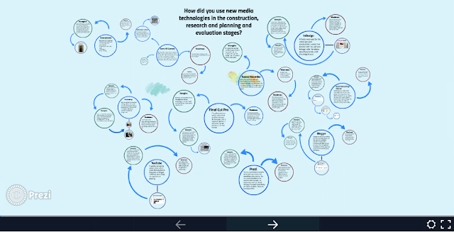
4. How did you use new
media technologies in the construction, research and planning and evaluation
stages?